Why Pretty Is Not Enough: Design as a Conversion Instrument
A beautiful website is nice, but does it convert? Learn the 7 principles of Conversion-Centered Design and the psychological triggers that turn visitors into customers.
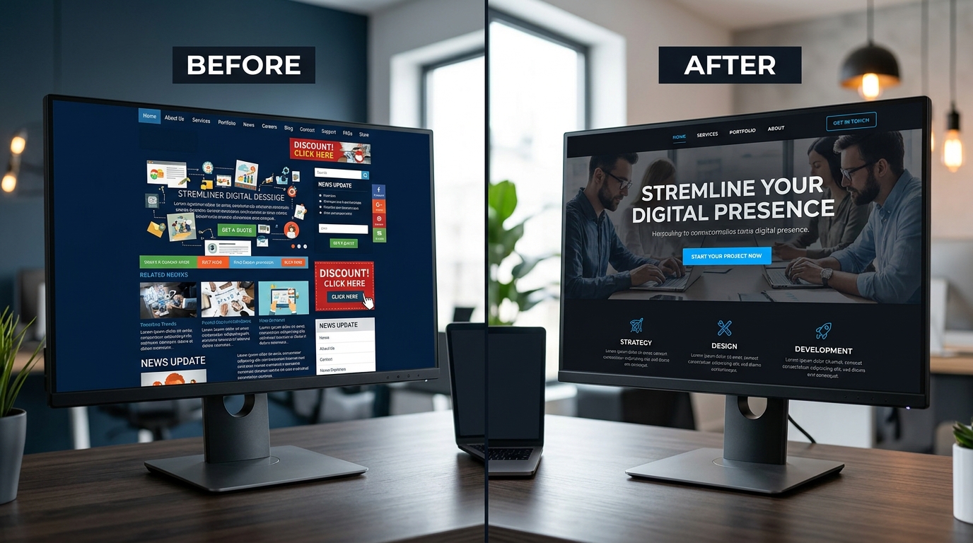
Many businesses invest thousands of euros in a beautiful website but see no results. The problem? They forget that design must serve a purpose. Pretty alone is not enough. Your website must convert.
In this guide, we share the proven principles of Conversion-Centered Design that we apply at Saerens Advertising.
The Problem with Pretty Websites
We constantly see this with clients who come to us:
- Designers focus on aesthetics, not conversion
- Visitors do not know what to do
- There is no clear visual hierarchy
- Too many options lead to choice paralysis
The result? Visitors leave the site without action. And yet good UX/UI can increase conversions by more than 200%. Conversely: poor UX drives away 88% of consumers.
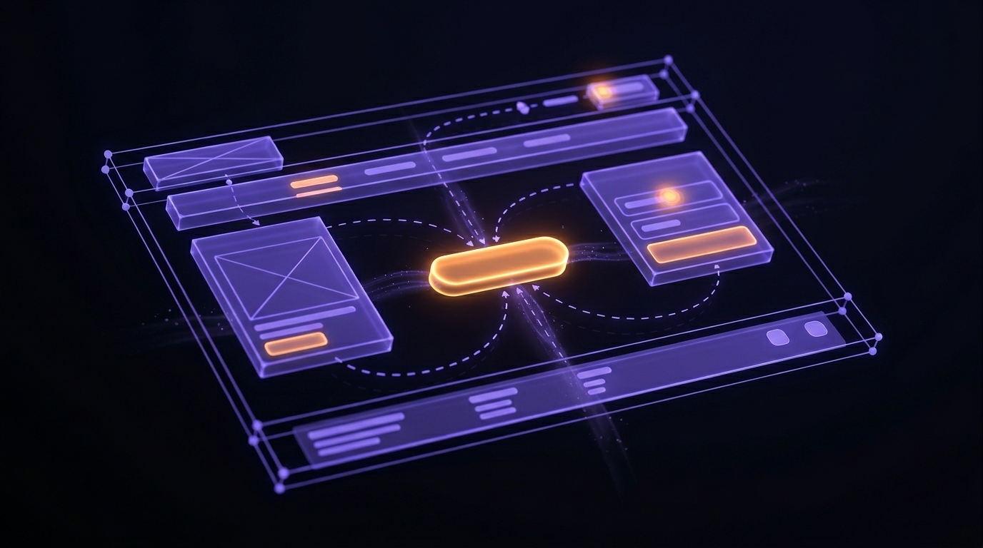
The 7 Principles of Conversion-Centered Design
1. Focus: One Goal per Page
Every page should have one primary goal. Too many options create analysis paralysis, so visitors cannot choose and do nothing.
- Remove unnecessary navigation links and competing CTAs
- Every design element should support the campaign goal
- Pages with multiple offers can reduce conversions by 266%
2. Structure: Guide the Visitor
Structure pages logically toward action:
- Clear information hierarchy
- Standardized layouts that visitors recognize
- Intuitive navigation based on the customer journey
3. Clarity: Make It Immediately Clear
Your value proposition must be immediately clear:
- Benefit-driven headlines that communicate what visitors get
- Simplify processes and reduce decision friction
- Clear, visible CTAs with action-oriented text
4. Consistency: Build Trust
Visual consistency builds credibility:
- Consistent colors, typography, and icons
- Match your landing page with your ad copy (ad matching)
- Uniform button styles and text alignment
5. Credibility: Eliminate Doubt
Uncertainty is the number 1 barrier to conversion. Overcome this with:
- Customer reviews, ratings, and testimonials as social proof
- Trust badges like guarantees and security certificates
- Logos of clients who trust you
Social proof alone can reduce cart abandonment by 11-15%.
6. Compelling CTAs: The Closing Piece
Your Call-to-Action must stand out and prompt action:
- Use high-contrast colors for CTA buttons
- Strategic placement with sufficient white space
- Visual cues (arrows, icons) pointing to the CTA
7. Reduce Friction: Make It Easy
Every unnecessary step costs conversions:
- Minimize form fields
- Fast loading times (every second delay = 7% conversion loss)
- Mobile-first optimization is mandatory
- Offer exit-intent CTAs for those not yet ready
Psychological Triggers That Convert
Urgency and Scarcity
FOMO (Fear of Missing Out) drives immediate action:
- Only 23 minutes left
- 7 items in stock at this price
- Place urgency messages close to CTAs
Color Psychology
- Red creates urgency and drives action
- Black conveys sophistication and luxury
- High contrast draws attention to key elements
White Space
Strategic use of empty space:
- Reduces cognitive load
- Directs attention to conversion elements
- Creates elegance and breathing room
Practical Implementation Checklist
- One clear CTA per page
- Benefit-driven headline
- High-contrast CTA button
- Visible social proof (reviews, ratings)
- Trust signals (guarantees, security badges)
- Load time under 3 seconds
- Mobile optimized
- Minimal form fields
- Visual cues toward CTA
- Consistent branding
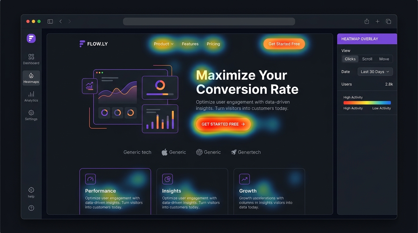
The Solution: Conversion-Centered Design
At Saerens Advertising, we design websites that look good and perform. Every element has a function. We combine design psychology with data-driven optimization.
Want to know how your website scores? Request a free audit and discover where you are leaving conversion opportunities on the table.
Need help with your marketing?
Request a free audit today and discover where you're missing opportunities.